Our enduring symbol of service
.jpg)
Our enduring symbol of service
A Red Shield sign at a post in Papua New Guinea during World War Two.
From its first appearance in World War One through to its adoption as the iconic symbol of the annual Doorknock appeal, the simple Salvation Army logo of the red shield has stood the test of time, writes Major DAVID WOODBURY
The utilisation of a symbol, such as a coat of arms, has been used for many centuries. It usually consists of an emblem denoting the character of an entity and generally refers to the cape, shield, crest, and helmet often used by knights.
Over the years, they have evolved into a symbol that explains family history, certain professions or occupations, and corporate and national identity.
The Salvation Army has two primary symbols that embody its mission: the ‘crest’ and the ‘red shield’. The crest, as we know it, first appeared on a letter from Bramwell Booth to Elijah Cadman on 26 March 1879, and the design by Captain William H. Ebdon was submitted as the official insignia.
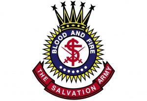
The official description of the crest (pictured) affirms the leading doctrines of The Salvation Army:
• The round figure, the sun, represents the light and fire of the Holy Spirit;
• The cross in the centre is the cross of Christ;
• The ‘S’ stands for salvation;
• The crossed swords for the warfare of salvation;
• The shots for the truths of the gospel;
• The crown of glory which God will give to his faithful soldiers.
Due to legal reasons, for some years, the use of the crest in the United States included the American eagle atop the crown.
While the crest remains the main symbol of The Salvation Army, it is not as well known or understood as the red shield, which has become an international symbol of Salvation Army service and ministry. However, the use of the terminology predates The Salvation Army, with the Rothschilds, a German family of financiers, utilising the words for their family insignia.
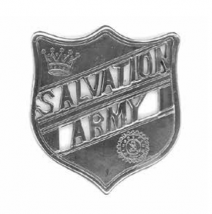
The literal translation of their family name means ‘Red Shield’ in German and signified Concordia, Integritas, Industria (Unity, Integrity, Industry). The Salvation Army’s use of a shield as a logo was common within the early Salvation Army. The familiar use was that of a 45-millimetre silver brooch pierced with the words Salvation Army and engraved with the crest and crown (pictured).
Early Salvationists wore them as a dress or hat badge appendage. The appearance of a red shield seems to have had its beginnings in The Salvation Army’s ministry to men and women in the armed forces during World War One. Pictured in an English War Cry in December 1915 was a photograph of an Army welfare hut bearing a shield with the words “The Salvation Army” emblazoned across it. Within a couple of years, it was claimed that: “The Salvation Army shield has become the best known and most prominent sign in the military training camps [and] among the troops in France.”
Accepted symbol
Early red shield signs were often handcrafted by serving personnel, and some early logos were on a blue background. They evolved throughout the war until a War Cry report in July 1917 described them as “a large shield on enamelled sheet iron with a blood-red background”.
The design was officially recognised when War Cry artist Joseph Hoy was requested by “Colonel [later General] George Carpenter, then Literary Secretary to Bramwell Booth, after the end of the First World War to consolidate the image of the Army’s recreation huts, mobile canteens, etc., which had been serving the troops during the war years, and continued to do so in the military establishments in Britain. But soon it became the accepted symbol for The Salvation Army’s widespread activities in the service of humanity”. (Correspondence from Joseph Hoy to Major D. Lorimer, 16 July 1988, held at Australian Southern Territory Archives and Museum.)
To celebrate the ministry of Red Shield personnel during World War One, a New Zealand officer, Henry C. Goffin, wrote what was one of the great iconic brass band marches of The Salvation Army – ‘The Red Shield’. Published in 1928, it became a firm favourite of brass band recitals both within The Salvation Army and among secular brass bands. The world-famous Black Dyke Band recorded it as the leading track on their album, World Class Marches of The Salvation Army, Volume 1.
With its redemptive theme on Jesus Christ as the Saviour, it featured heavily in Australian newspaper adverts in the 1930s as a feature of Salvation Army band programs.
Familiar logo
It would appear that the Australian public had little knowledge or understanding of the red shield until the outbreak of World War Two when ‘Red Shield’ huts and marquees were to proliferate wherever servicemen and women gathered. One of the earliest references is found in the Lismore (NSW) Northern Star of Saturday 14 October 1939.
The Star went on to report on a military camp being set up in Victoria: “The interests of the men going to camp with the militia are being given every consideration by The Salvation Army,” said the report. “A large marquee, writing tables, stationery, crockery, piano, and materials for a platform, with lighting arrangements in the form of petrol lamps, in fact, a complete equipment for the well-known war work, which will go on at the sign of the Red Shield ... is en route from Melbourne to a certain spot in Victoria, which is rapidly being transformed into a canvas town, the population of which will soon take possession.”
![]() The red shield logo is prolific in the community, especially around Red Shield Appeal time each year.
The red shield logo is prolific in the community, especially around Red Shield Appeal time each year.
The red shield logo was to become one of the most familiar symbols of Salvation Army ministry to servicemen and women throughout World War Two and can still be seen at various military establishments throughout the world affixed to huts and vehicles used by Red Shield Defence Service personnel.
Today, the Red Shield logo used on signage, printed materials and fundraising appeals has white lettering and a border on a red background. The shield usually has gold lettering and border when used as part of a Salvationist uniform on the cap or collar badges. Because the Red Shield emblem came to represent The Salvation Army’s reputation for being at the frontline of need, the red shield was incorporated into the name of The Salvation Army’s annual fundraising drive in Australia, the Red Shield Appeal, in the 1960s.